Responsive web design is a crucial aspect of modern web development. It ensures that websites provide an optimal viewing and interaction experience across a wide range of devices, from desktops to smartphones. Here’s why responsive web design is important and how it impacts both users and businesses:
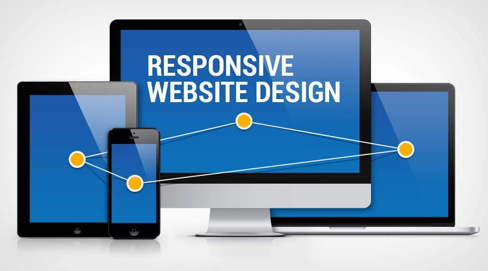
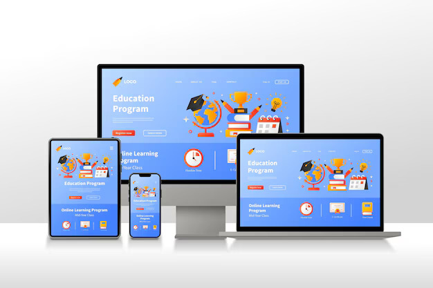
Responsive web design is an approach to web development that makes web pages render well on a variety of devices and window or screen sizes. It uses fluid grids, flexible images, and CSS media queries to adjust the layout and content dynamically based on the screen size and orientation.
Accessibility: Responsive design ensures that users can access and navigate your website easily, regardless of the device they are using. This leads to a more positive user experience.
Consistency: Users get a consistent experience across all devices, which helps in building trust and familiarity with your brand.

With the growing number of users accessing the internet via mobile devices, having a mobile-friendly website is essential. Responsive design caters to this audience, helping to capture and retain mobile traffic.
Search engines like Google favor responsive websites. A single, dynamic version of your site makes it easier for search engines to crawl, index, and organize your content. Responsive design can improve your search engine rankings.
Maintaining separate websites for desktop and mobile can be costly and time-consuming. Responsive design allows you to manage one website that works seamlessly across all devices, reducing maintenance and development costs.
Responsive design techniques, such as optimized images and streamlined code, contribute to faster loading times. Speed is a critical factor in user satisfaction and can also affect your search engine ranking.
A consistent and user-friendly experience can lead to higher conversion rates. When users can easily navigate your site and find the information or products they need, they are more likely to complete desired actions, such as making a purchase or filling out a form.
Responsive design is based on screen size, not device type. This means your website will be prepared for future devices and screen sizes, ensuring long-term usability and relevance.
If a user lands on your site and finds it difficult to navigate or read on their device, they are likely to leave quickly. Responsive design helps to keep users engaged, reducing bounce rates and encouraging longer visits.